Showing posts with label Research. Show all posts

Tuesday, 15 April 2014

Ideas And Inspiration For Film Poster

Although Invictus is a very different style to our film I really liked the way Morgan freeman has his back to the viewer, as in our trailer it features a piece of dialog which sais "The worlds a dangerous place to live in you've got to be constantly looking over shoulder" and replicating this kind of pose with Jason Dyer looking slightly over his shoulder would work well as an image for the poster. I also like where the film title is positioned and will most likely position my text in a similar way as it works well with this pose.


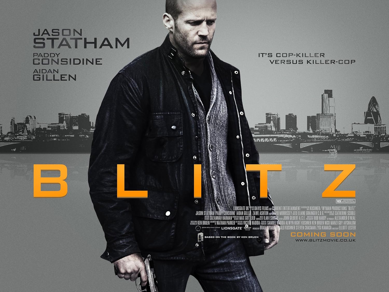
After looking into Blitz I really liked the typeface they used so i researched and in the end found the exact or very similar typeface called Bank Gothic which I will use for my poster as I feel it fits in very well with our genre. I also like how the image of Jason Statham is in black and white as this also indicates possibly the darkness of the film which is also similar to our film which I hope to use for my poster.


Magazine Front Cover Progression

After reviewing the feedback I was able to make some changes to improve my front cover as a whole. Firstly one of the main problems was how unclear and dark the cover was, after second look I also felt it was to dark. I wanted to keep the metallic looking background as I felt it worked well so reduced the opacity to lighten it up which made the image become more clear. Also I had noticed on the majority of Little White Lies covers the actor is looking straight ahead where as on my cover the image is looking to the side. I felt the image worked and felt I would break the codes and conventions in terms of this for my cover. The positioning of the text didnt work to well to I experimented moving it about and in the end from suggestions people said due to the direction of the eyes in the image positioning it to the left hand side may work well, I still wanted to keep the font and its colours as people really liked this on the cover as they felt it showed good contrast between the darker colours. 

Also apart from above Louisa mentioned there could be more detail in the centre as the face appeared rather blank compared to the lower half of the cover. I didnt want to add more detail lines as I didnt want to make the image to realistic so instead I had some brushes in Photoshop which replicated concrete crack and mud splats which i placed around the face and body which seemed to work well and again fitted in with the genre of the film aswell as the cityscape and metallic background.


Planning And Inspiration For Film Magazine

From research into existing film magazines I have decided to produce a Little White Lies themed issue in relation to my group’s film. Researching and analysing and issue of Little White Lies has helped in relation to the structure of the magazine as well as the artistic style, it has also help me find the dimensions of the magazine itself so when I’m producing the cover in Photoshop it can be as accurate as possible. I also want to have the style similar to the film Drive which features an 80s style typeface which I have found called Mistral which I will have in the classic turquoise and pink.

Layout I will use for my front cover


Mistral Typeface


Public Enemies Film Poster Analysis

This poster was used as the promotional film poster for 2009 film Public Enemies. The film itself is based on notorious American criminal John Dillinger. The film focuses on “The Feds try to take down notorious American gangsters John Dillinger, Baby Face Nelson and Pretty Boy Floyd during a booming crime wave in the 1930s.” Firstly the poster itself features very dull colours manly blacks, browns and greys which is an indication that the film has a more formal and serious approach as well as linking in with the film genre in general which would be a crime drama film. Also the colours could also indicate a darkness to the time period as well as the character in general as it based on the criminal John Dillinger. What also works well with the main image is the way it gives indications to the reader of the time period simply due to the costume consisting of the trilby hat and smart coat, as well as  the gun itself which was a popular choice of weapon during the 30s for gangsters. Another indication of the time period of the film would be the cars in the background, these cars were iconic for the time as well as iconic cars use by gangsters. In terms of success of the poster it works well for many reasons. Firstly it feautres the main character of the film played by Johnny Depp. Featuring him on the front cover not only shows people who is in the film but also would appeal to people who like Johnny Depp as an actor. Johnny Depp is holding a gun which is a strong indication of the genre of this film and would possibly attract the male audience as it could feature a level of action and violence. In terms of text for the poster the type face looks very similar to a police badge font which is also another strong indication of the genre of this film. The text itself is in white however the title of the film appears to have a silver tint to the film making it more eye catching to the audience. Above the film title it does feature Johnny Depp’s name however it is written in very small font, however the image of Johnny Depp is very large and due to Johnny Depp being a very popular Hollywood actor he is very recognisable which could have been why this is written in smaller text. The text below features other actors in the as well as crediting producing companies and distributors. To the lower left hand side it features the American rating of the film which is rated R, again another indication of the genre as well as target audience. At the very bottom it feautres possibly the most important piece of text to the poster. The date is in the same font and colour as the film title which could have been done as these are the two biggest pieces of information on the poster. The poster sais “Summer 2009” which would indicate it was a very early poster and another poster may have been produced after this giving the exact date of release. Overall this poster works well as it features a clear image of the star actor as well as featuring iconic images of the time period its set in as well as it showing clear codes and conventions of its genre.

Sunday, 13 April 2014

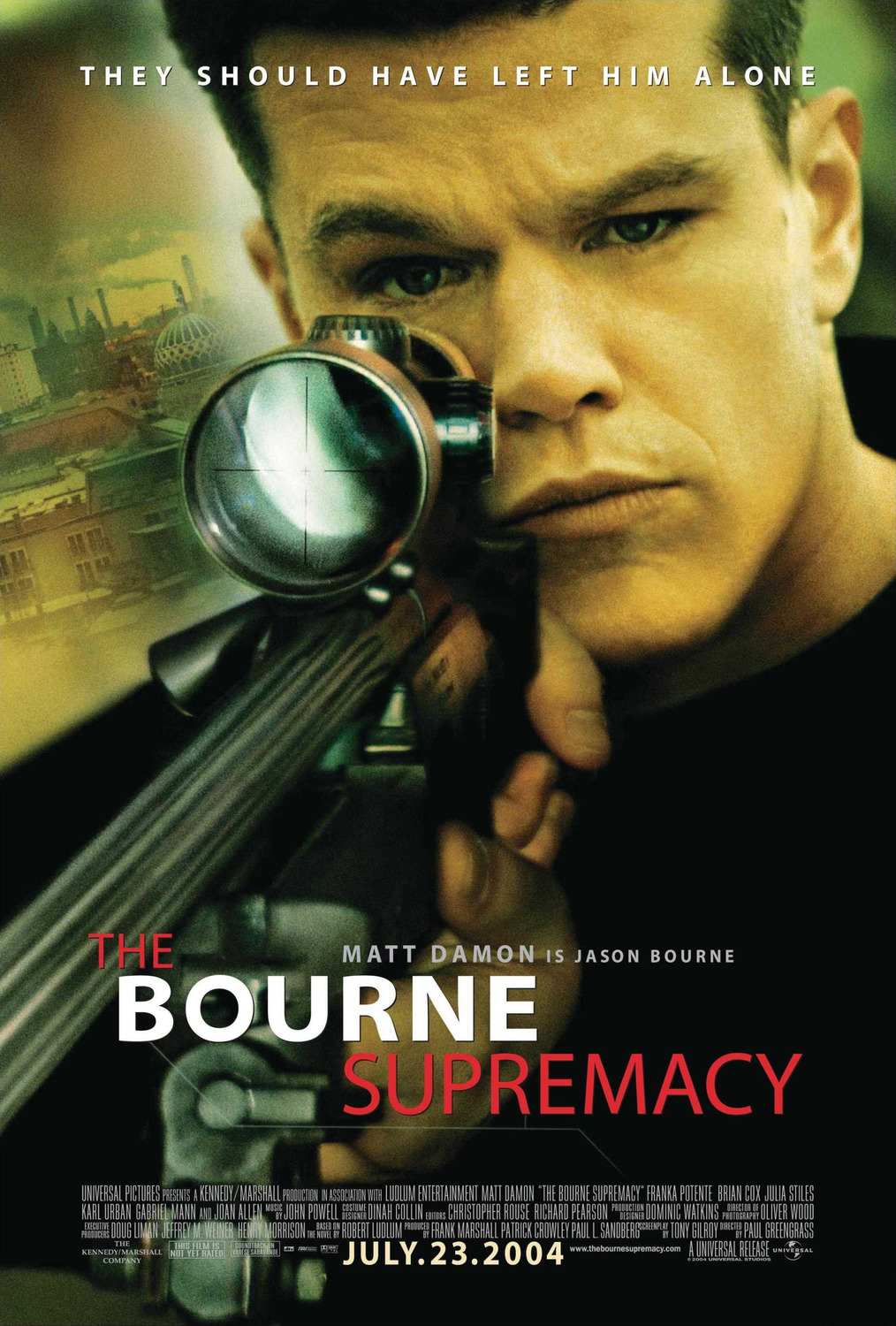
The Bourne Supremacy Film Poster Analysis

This poster was the promotional film poster for the 2004 film The Bourne Supremacy. The film itself was the 3rd film featuring the character Jason Bournce played by Hollywood actor Jason Bourne. Firstly the poster itself is very basic and isn’t over cluttered. In term of images it features the main image of Jason Bourne (Matt Damon) and also an image of what appears to be a street environment and most likely India as this is where this film is set. The main image of Bourne appears to make slight eye contact with the viewer which would attract and draw their attention to the poster itself. The image as well has been taken to whichever way you look at it Bourne makes eye contact with you. The image as well also features him holding a gun which would indicate the genre of film as well as being a typical convention of a thriller action film. In terms of colours both the images blend and work well with each other and have a slight orangey greeney tint to them which indicates the the seriousness of the poster as well as it fitting in with its dark plot as well as the genre of the film unlike possibly a film targeted at kids which would feature all bright and colourful colours. The posters font is a very formal font and is a serif font which alternates from bold to regular text. At the top of the poster we see a slogan strapline which Sais “THEY SHOULD HAVE LEFT HIM ALONE” which also indicates possibly the danger of the character and that the film will involve possibly people attempting to attack Jason Bourne or possibly kill him. This piece of font is in a white colour and works well as it stands out and doesn’t clash with other colour. Towards the lower half of the poster we see the title of the film which alternates from “The” and “Supremacy” in regular font and the “Bourne” written in Bold text. Also above the title it also says the actors name and also states that “ MATT DAMON is Jason Bourne” which is a good way of appealing to fans of Matt Damon as well as informing people which character he plays. Below this it also features the standard accreditations of Directors, Producers etc which is in the common font which is small and in white. Below this it features accreditations towards the production companies as well as the distributors in this case Universal and The Kennedy Marshall Company as well as featuring the films website. The last piece of text is at the bottom of this and is very important as it is the film release date, due to this being important this is in bold white text which stands out on the black behind it. 

Exit Polls


Exit Polls are information in relation to films about its audience in terms of ages as well as how people became aware of the film for example advertisements and posters. Exit Polls are usful in the sense it allows people to be aware of the most popular and common place a person found out about the film. Today there are more than ever ways of promoting your film including a wide range of ways on the Internet. Exit Polls are surveys which are produced by the BFI. I looked on there website and found this exit poll for the 2009 film Looking For Eric which is about "Eric, a football fanatic postman whose life is descending into crisis, receives some life coaching from the famously philosophical Eric Cantona"


Looking For Eric (2009)
Number of people surveyed155
Male87
Female68
Under 2545
Over 25110
Sources of Information
Advertisements (TV)43.2%
Reviews (Magazine/Newspaper)41.3%
Family and friends told me about it41.3%
News features/talk shows (TV)39.4%
Outdoor posters36.8%
Trailer shown at cinema29.7%
Advertisements (Magazine/Newspaper)29.7%
Reviews (TV)25.8%
In-cinema posters/display/banners21.9%
News features/talk shows (Magazine/Newspaper)17.4%
Reviews (Radio)17.4%
On-line ad banner16.1%
Advertisements (Radio)15.5%
Internet reviews/other online11.6%
FC United1.9%
Red issue1.3%
Filmed near my home1.3%
Eric told me0.6%
Baits to Attendance
It stars Eric Cantona54.8%
It was directed by Ken Loach39.4%
The story appealed to me35.5%
The reviews32.9%
The genre/type of film27.1%
I was asked to come along by a friend/partner20.6%
The advertising I have seen15.5%
It is about a footballer15.5%
Other7.1%
The film's poster5.8%

From this Exit Poll it is clear that Looking For Eric is more popular with the male audience as well it being more popular with Over 25s possibly due to Eric Cantona himself would have been playing football when they were younger. It is also clear that the people surveyed found information about this film due to TV advertisements at 43.2% as well as Reviews and Family and Friends at 41.3%. In terms of what appealed to the people surveyed it was obvious they would see it as it stars Eric Cantona at 54.8%

Saturday, 12 April 2014

Film Posters

When a film is made and ready for release a theatrical poster to advertise the film is made promote the film. Posters can range from anywhere from being at the actual cinema to being on a board at a bus stop. In terms of posters there is various types of posters which serve different purposes for promoting the film.

Teaser
The first type of poster is known as a teaser poster and this poster contains basic information which attracts you towards that film. It often does not indicate much about the plot, but may include the leading actors, which again would spark interest from people if they like the work of that actor. A teaser poster will also include the title of the film.

Main Poster
Another form of poster is the most important and is the actual main film poster. This form of poster includes elements of the teaser poster but also involves more information mainly focused at the production companies, distributors as well as the leading actors and distributors. This poster will possibly also include a typical slogan of the film as well as possible quotes from reviews of possible newspapers and magazines. As well as all that they also include the release date which is the most important. The typical positioning of the release date is commonly placed underneath the film credit block.


DVD Release Poster
This form poster comes out when the film is released on DVD or Bluray and commonly features the majority which is on the main poster, but also includes one line reviews from magazines or newspapers. This poster is put out possibly few weeks in advance in order to attract people to purchase the DVD or Bluray


Character Poster
The final form of poster is a character poster. This form of poster is very simple and will feature a main character from the film as the main focus but also including the actors name as well as the films logo or text title. The poster also features the release date as well as crediting the distributors and production companies.


Empire Front Cover Analysis

Empire magazine is a monthly British film magazine. The magazine itself is part of the Bauer media media group. The magazine itself was first published back in 1989 which when the magazine was previously owned by media group EMap. Empire features typical features which you would expect to see in a film magazine including: film news, previews and reviews. The cover of Empire is very heavily filled with coverlines and plugs. With most issues of Empire the main image on the front of the magazine will be a character from a film which will be the main focus of the issue. The image itself usually features the main character in a very authoritative pose and backed up with large bold text which indicates to the reader what the main focus of the issue will be about. The empire masthead stretches over almost the whole of the page and is bold text which is in red. This is a common convention for Empire and is very eye catching which works well as it would attract readers attention. The front cover as well as featuring the main feature in this case Superman, also features other film titles in this case it features Iron Man 3, Thor, Kick Ass 2 and a few more. This issue would appeal to those who are fans of super hero films as this issue seems to heavily feature these types of films. Also one other thing for this issue of Empire is the consitancy shown in terms of colours they have stuck to 3 colours which all work well with each other (Red, Black & White).Going back to the image for this front cover Supermans head covers part of the Empire masthead, this is a consistent visualy style which the editors of Empire use and is used for every front cover of the issue.


Little White Lies Front Cover Analysis

Little white lies is a british independent film magazine. The magazine itself is a monthly issue magazine. The magazine has typical features which you would find in most magazines including reviews and written pieces. Little White Lies has a very unique style in the sense the covers are either illistrations, paintings and sometimes computer graphic pieces. What also makes it unique is its magazine size. Commonly magazines are in an A4 format where as Little White Lies has a smaller size magazine and has the dimensions of 20cm H x 24.5cm W. Unlike other existing magazines Little White Lies on its cover doesn’t feature any cover lines, kickers etc. The only feature on the front of the magazine is the illustration and the title of the film which is the main focus of the issue. The majority of Little White Lies covers feature an illustration of the main character from a film. Little White Lies also shows the main feature in photography in relation to film and the main film focus. Depending on the film or actor this type of cover is ideal as it would attract readers due to them identifying the actor on the cover. The style of the cover can range for example this cover is typically a painting whereas the cover can also be a pencil drawing or a charcoal drawing. Featuring the title of film will appeal to readers who like that film the title of the film is featured within the painting whereas in over film magazines it is written in a digital type face. Just featuring the title of the film indicates that the film will be the main focus within the issue and not featuring any other cover lines, kickers etc adds a sense of curiosity to the reader which would possibly intrigue them and mean that they would be more likely to buy the magazine. What works well with the Little White Lies front cover is how it features its masthead, date, price and barcode all in one neat circle which is central at the top of the page. It Is common with magazines to feature its barcode, price and date within a small white box which is situated more towards the bottom of the cover. Little White Lies with its artistic covers all feature the actors face looking forwards which could be done to make eye contact with readers but also to make it clear who it is. However in some issues this is different and you either dont see there faces or it doesn't feature the actor on the front for example the edition which featured The Pirates on the cover. I also would consider breaking its usual style of having the actor face forward and have the actor not making contact and facing slightly away.

Monday, 9 December 2013

Music Selection

Music in relation to trailers and teasers is important as it must link in with the genre or genres as well as fitting in with the scenes. Due to choosing a hybrid genre (Crime Action Thriller) the music will need to fit in with violence as well as creating a sense of tension to leave the audience in suspense and make them want to see the film. Within our group we discussed possible songs which could work.


Everything in its Right Place by Radiohead
This is very fitting for the theme of the film as it has a dark, yet ambient feel to it. Also the music relates to a feel we are going for in trying is lulling the audience into a false sense of security. It also is slow paced which if used would be used at the beginning of the trailer, linking in with the codes and conventions in relation to our trailer, starting of slow then speeding up.

Keyboard Milk by Royksopp
This song has slightly a more energetic feel to it. It also fits in with the the codes and conventions of the trailer. It starts of slowly building up and then becomes pacey which could work very well with fight scenes. The pace at the beginning also builds tension without having to change the music to a different track due to its pace increasing as the music goes on. Overall this is a top selection for the music purely due to it starting of slow and building up in pace which fits in perfectly with the codes and conventions of the trailer.


Block Rockin Beats by The Chemical Brothers
This piece in particular would be used during the action packed part of the trailer due to its pace. The music would be commonly found in action films as it has that sound which would be associated with action. Also it would fit in well with the chase scenes which we will be filming. Overall it could be a good option when editing the fight scenes and chase scenes in our trailer. If used it could only be used for a small part of the trailer.

Sun Child by Cassius
This song in particular is very similar to some of the music in the film “Drive” which was partly the inspiration to our film in the context of action. The music is very similar to the opening song in Drive, therefore it would be a good choice for the start of the trailer as it is a slow paced song, but at the same time creating tension. If used it could only be used for a small part of the trailer and would mean having to make a cut and switching to a more fast paced song as the trailer goes on.


Jasmine by Jai Paul
This song is a slow paced song which if used would be used at the start of the start of the trailer due to its pace. The song in particular has a powerful bassline which would build tension as well as it having slight haunting vocals which would fit in with the mood. If used it could only be used for a small part of the trailer and would mean having to make a cut and switching to a more fast paced song as the trailer goes on.


'Cadillac Dreams' by Birdy Nam Nam
This song has a very chilled yet powerful feel to the song. It has the same beat throughout making it necessary for the trailer seeing as it has that certain repetitiveness to it. Overall the pace is slow which means it would only be able to be used at the start of trailer or it would be breaking the codes and conventions of the trailer genre if it was used towards the end.


Cockney Thug (Caspa Remix) by Rusko
only a few seconds of this song would be used most likely between 0:32 and 0:42 as they contain a sample which we would be interested in using as it has a certain shock factor to it and it would be a good transition to use to change the music if need be in the trailer.


Canon by Justice
This piece in particular is at a fast pace which means in terms of use for this trailer would be used at the middle and the end. The song would fit in well with action scenes due to its pace and feel to the song. This song also shows similarities to some of the music used in “Drive”.


Overall from looking into music choices we have a strong selection to choose from which will be helpful once we have finished filming to see which music fits in well with parts such as the action parts e.g fighting and the more calm parts at the beginning e.g walking 

Characters and Profiles

Jason Dyer-
Played by Tom Nelson

Jason Dyer is one of the two main characters that features throughout the film. He is the typical cockney character and shows similar traits to existing actors such as Jason Statham in terms of accent as well as role which is being played. Characteristics which he shows is being an aggressive and violent man. What makes him so identifiable is his iconic jacket which he wears, which has a similar feel to. Overall his character is purely a hitman who assists the second main character Rory Mcbride. Dyer is also a very unpleasant man which is in total contrast to Rory Mcbride who is seen more of a weak and untidy man.

Rory Macbride-
Played by Joe Inns

Rory is the second main character who is the one which is involved in the gambling fix which causes him to lose everything he has. Rory then turns to Jason Dyer (1st Main character) who assists him in tracking down and killing those who have played a role in making him loose his money. Mcbride at the start is shown as a weaker character in contrast to Jason Dyer who is a strong confident figure. However throughout the film he begins to show signs of being a stronger figure due to being around Dyer. His clothes are seen to change quite often, and tend to be a rugged, scruffy style including a beanie hat and a Harrington jacket accompanied with his long messy hair. In a sense Mcbride is seen as Dyer’s sidekick who shapes into a stronger character as the film goes on.

Barry Bright-
Played by Micah Hills 

Barry Bright is seen as more of a secondary character but still has an important roll within the story and film. He is seen as the main leader. He will feature in the film commonly mainly within the poker scenes but also will feature in chases which will be more towards the end of the film. Due to him being the most popular target on Dyer’s list he will be the last to be caught.

Sam Williams-
Played by Alex Fox

Seen to be a black market dealer and gambler who is thought to have stolen the money that the film is centered around. He, like Barry Bright is seen as another character who is included on Dyer’s list who is then tracked down by Mcbride and Dyer. He will be a character that is seen at the beginning and then finally caught by an on foot chase by Dyer.

James Bowen-
Played by Stan Pugh 

James is seen more of a crook and a henchman character who gets into a lot of fight scenes He also features on Dyer’s list and keeps reappearing throughout the film commonly in fight scenes but also seen with others who are featured on the list. He is finally caught at the end of the film just before Barry Bright where he is killed instantly in a gunfight.

David Wilkins-
Played by Mark Rowland

Owner of the warehouses that the gambling match takes place in, he is a profound and frequent gambler who has a hired bouncer for protection as well as to show off his authority. He also is on the hunt for Williams as he walso is on the hunt for Williams as he wants the money.

Bouncer-
Played by Dom Williams

The bouncer is seen as the property of David and is a large, strong character who doesn’t tolerate anything. He, like Dyer is also very violent and is commonly seen throughout the film with metal bars as well as physically throwing people to the ground, Including Dyer. We never see this character die due to his power.

Extras- (Seen in poker scenes and in various parts of the film)
Christian Turner
Joe Dunkerley


Monday, 25 November 2013

Location Selection


These Images below are locations which we went out and found to use for our film. We wanted to select locations which have a gritty urbanised feel to them. We also went for a church which also showed a contrast between the other urbanised locations.


Friday, 22 November 2013

Costume Selection For Film Trailer

Jason Dyer
Dyers costume has a typical hard man , basic look to it. The inspiration of wearing a jacket came from Drive, As Ryan Gosling is well known and seen wearing the iconic jacket throughout the film. For Jason Dyer we decided to do a similar thing and have him wearing a jacket which wasn’t a bright colour but still gave him an iconic look which he would possibly cause him to be remembered by. Dyer also wears another jacket, however this is an adidas tracksuit jacket which is worn by the character casually. The brown jacket is a jacket which is worn when dealing with the people listed on the list, Which again is similar to drive as throughout the film he also wears other jackets such as a casual denim jacket.In terms of other clothing we decided to have him wearing plain/pastel colours. For example tshirts worn throughout all are plain colours such as a burgundy tshirt and a navy tshirt. For trousers again we wanted a to achieve a simple look as well as trying to achieve a serious approach to the costume. For this we chose simple black skinny jeans which were accompanied by adidas trainers which again have a basic look to them as well as looking worn and dirty. However we did change shoes for certain scenes but were still a sports based shoe.The second pair of shoes are a pair of New Balance trainers which were clean, which would reflect on the success of the killings throughout the film.


Rory Macbride

Rory’s costume was also a basic clothed character, mainly due to the fact of his gambling issues and troubles. His clothes are seen to change quite often, every couple of scenes. The colours worn by Rory are again similar to Jason Dyers character. The connection between the hair, hat and jumpers show that Rory has a rugged almost pitiable look. Also what reflects the poorness of Rory’s character is the really worn out trainers which hes wears, there appearance are grubby as well as old looking. He also wears black jeans which are a simple plain item for the costume which reflects the character in general.


Thursday, 7 November 2013

Film Exhibition

The first moving picture was shot in Leeds by Louis Le Prince in 1888 and the first moving pictures developed on celluloid film were made in Hyde Park, London in 1889 by William Friese Greene. In the early years of Cinema in Britain, films were all silent and meant the use of music was created by a organist who would improvise the music in relation to the mood of the scene as well as facial expressions made by the actors. By the 1920s, some cinemas even had live full orchestras playing the music until 1927 when fully synchronised sound arrived. By the time synchronised sound was brought in British cinemas half of Britain's population went to the cinema at least once a week. Alongside the main film, audiences would also watch ‘B’ pictures and newsreels as well as experiencing live entertainment on the stage. In total this combined with the film itself lasted for approximately four hours. By 1939 there were around 5500 cinemas around the UK, this meant more people could experience going to see a film, which led to the highest cinema attendance in Britain in 1946. The cinemas themselves varied in size but the majority looked like the classic theatre where people would go see dramatics productions including an upper level as well as a lower level. After this however it dipped in popularity in 1951. By the 60s cinema popularity fell to a low of 75%. After the 50s the popularity of cinema declined each year. 


Post War Poverty 
In 1947-1948, US film distributors boycotted Britain because the government proposed putting a high import duty on imported films. Due to this British cinemas had to fall back on old and poor quality films. Cinema audiences never recovered. Entertainment tax went up; audiences couldn’t afford to go to cinemas and prices of tickets increased as well as money and labour, which was channelled into house-building due to devastation of the war. Very little left available for repairing cinemas. Progressing forward from the war the 1980s played a large factor in British Cinema. Firstly, Video hire was a further blow to the cinema. There were less than 1000 cinemas open in Britain around in about 1985. Apart from that it had a slight increase. In 1985 there was a large increase of “Multi Plex” cinemas which could show more films due to it having 6+ screens to show the films on. Also the multiplex cinemas meant more people could see films due to the increase in screens. Since when film first started the technology had improved dramatically, with films now featuring film now being digital as well as surround sound and some films even being shown in 3D. However today ticket pricing for films have increased largely this also is due to films being in 3D.