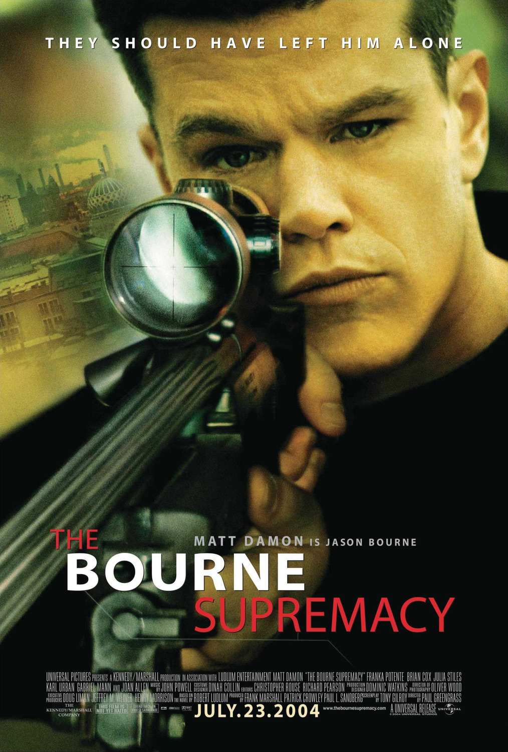
This poster was the promotional film
poster for the 2004 film The Bourne Supremacy. The film itself was the 3rd
film featuring the character Jason Bournce played by Hollywood actor Jason
Bourne. Firstly the poster itself is very basic and isn’t over cluttered. In
term of images it features the main image of Jason Bourne (Matt Damon) and also
an image of what appears to be a street environment and most likely India as
this is where this film is set. The main image of Bourne appears to make slight
eye contact with the viewer which would attract and draw their attention to the
poster itself. The image as well has been taken to whichever way you look at it
Bourne makes eye contact with you. The image as well also features him holding
a gun which would indicate the genre of film as well as being a typical
convention of a thriller action film. In terms of colours both the images blend
and work well with each other and have a slight orangey greeney tint to them
which indicates the the seriousness of the poster as well as it fitting in with
its dark plot as well as the genre of the film unlike possibly a film targeted
at kids which would feature all bright and colourful colours. The posters font
is a very formal font and is a serif font which alternates from bold to regular
text. At the top of the poster we see a slogan strapline which Sais “THEY
SHOULD HAVE LEFT HIM ALONE” which also indicates possibly the danger of the
character and that the film will involve possibly people attempting to attack
Jason Bourne or possibly kill him. This piece of font is in a white colour and
works well as it stands out and doesn’t clash with other colour. Towards the
lower half of the poster we see the title of the film which alternates from “The”
and “Supremacy” in regular font and the “Bourne” written in Bold text. Also
above the title it also says the actors name and also states that “ MATT DAMON
is Jason Bourne” which is a good way of appealing to fans of Matt Damon as well
as informing people which character he plays. Below this it also features the
standard accreditations of Directors, Producers etc which is in the common font
which is small and in white. Below this it features accreditations towards the
production companies as well as the distributors in this case Universal and The
Kennedy Marshall Company as well as featuring the films website. The last piece
of text is at the bottom of this and is very important as it is the film
release date, due to this being important this is in bold white text which
stands out on the black behind it.
No comments:
Post a Comment